development · map styling
Cartography with one bit of ink
The panel has no colour. It has black and it has white, and on a map that means every distinction a paper map makes with green, blue and red has to be made with something else: line width, a white gap down the middle of a road, the angle of a hatch, the period of a dither. All of it lives in one file, mapstyle.json, and the whole map is designed in it.
Why the style is the design
On a colour screen a map hierarchy is mostly paint. A motorway is orange, a river is blue, a forest is green, and the reader sorts them out before reading a single shape. Take the colour away and none of that survives. Every colour field in our style file is black, which is why they may as well not be there.
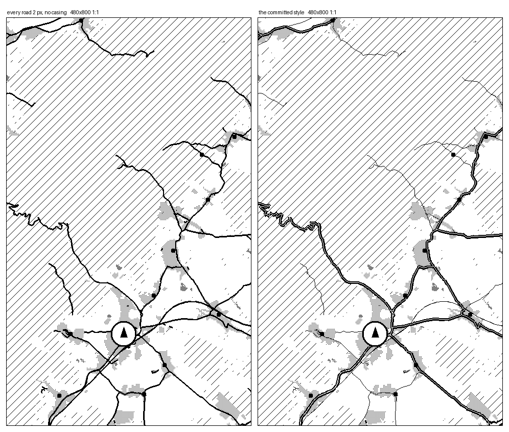
What is left is the older toolkit, the one engravers used: weight, casing, dash, tick, tone and hatch. A main road is wide. A really main road is two thin black edges with white left between them, so it reads as a ribbon rather than a smear. A track is a dashed hairline. A railway is a line with ticks across it. A forest is a diagonal hatch, a village is a fine dither, and the two must differ in pattern or their shared boundary disappears.
A one-pixel line matters here in a way it does not on a phone. There is no antialiasing to hide behind: a line is on or off. So every length in the file is in device pixels against the 480 by 800 panel, the X4 and X4 Pro's frame, and one pixel either way is a real decision. The style is authored against that one canvas; see "What the style cannot do yet" below for what a wider panel, the X3 or the LilyGo T5 S3 Pro, still gets wrong.
One file, compiled into the firmware
data/mapstyle.json is the only style file in the project. There is no theme
picker on the device and no style parser either: the file is a build-time input. A script
turns it into C structures, the firmware compiles those in, and the device does an array
lookup to find the style it should draw with.
That matters for a battery device. Parsing JSON on an ESP32-C3 with 247 KB of heap, on every map redraw, to arrive at numbers that never change between builds, would be paying rent for nothing. The runtime cost of the entire styling system is two array indexes.
The file is organised as layers, in the order they are drawn. Built-up areas and forest first, then water, then buildings, then roads, then the route, then place dots and names on top. The order is not cosmetic: a name has to be placed against the finished picture, because whether it fits depends on what is already there.
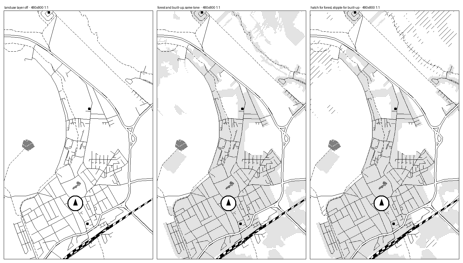
Tone and hatch: the four greys that are not grey
An area fill on this panel is a pixel pattern, anchored in screen space rather than to the shape. Screen space is what makes two buildings a metre apart share one texture instead of each starting its own, which is the difference between a village reading as a built-up area and reading as noise. Four tones exist:
- stipple, one pixel in nine: the lightest texture that still reads as a texture.
- light, one pixel in four.
- dark, one pixel in two, a checkerboard.
- solid, for a shape too small to carry a pattern at all.
Stipple has a period of three and the other two have a period of two, on purpose: patterns that share a period line up and stop looking like different fills. Hatch is the other option, with an angle and a spacing in pixels, and it is what forest uses. Buildings get a hatch too, at the closest rung only, where a building is 21 pixels across and is what the rider is actually looking at. One rung out a building is 7 pixels, and drawing them all measured 4,122 ms of that rung's 7,463 ms frame on the device: 55 percent of the slowest frame in the ladder, spent on texture nobody could read. That is one line in the style file now.
Every block can change with the zoom rung
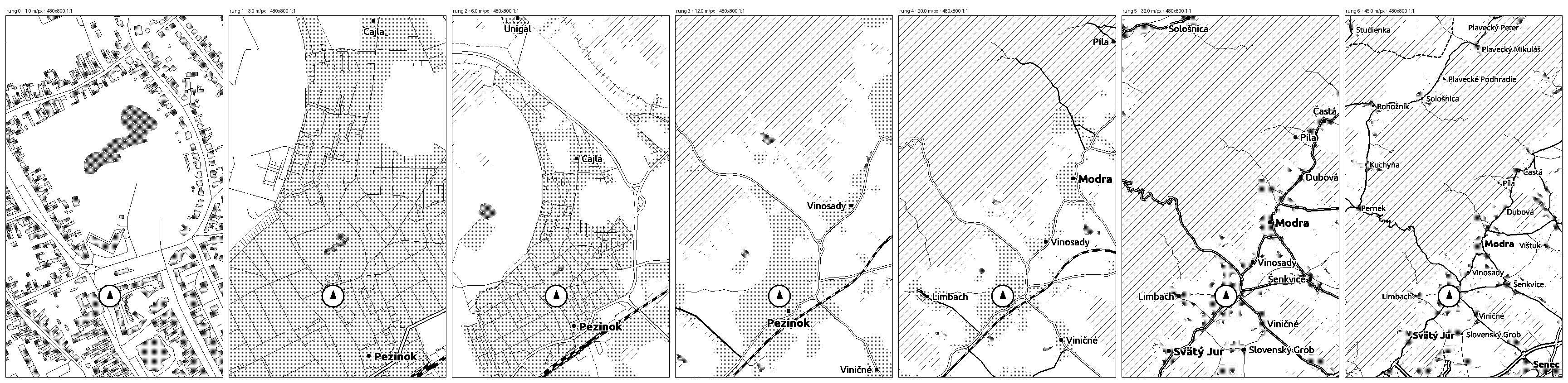
The map has seven fixed zoom rungs, from 1 metre per pixel to 45. A device pixel is one metre of ground at the bottom of that ladder and 45 metres at the top, so a fixed eleven-pixel motorway is an eleven metre road at one end and a 500 metre band at the other. We shipped that once. It turned the wide views into a black web.
So any block in the file can carry a when list, and the build resolves it:
{
  "match": { "class": ["primary"] },
  "width": 9, "casing_px": 2, "major": true,
  "when": [
    { "steps": [3, 4],                 "width": 5, "casing_px": 1 },
    { "steps": [6],                    "width": 6, "casing_px": 1.5 },
    { "modes": ["hike"], "steps": [6], "hidden": true }
  ]
}
The outer fields are the base, a when entry patches them, and the last
matching entry wins. No specificity scoring: the file reads top to bottom, the way the
panel is drawn.
A table rather than one multiplier, because there is no single curve. A motorway has to stay visible as it thins. A residential street should disappear rather than get thinner. A railway's tick rhythm is not a width at all. Three different decisions per class is a table, and the table is what the ladder below is tuned against.
hidden is worth its own sentence. A class hidden at a rung is not drawn, and
it is also not read: the build intersects it out of that rung's class mask, and the tile
reader skips those records without decoding them. Turning something off in the style makes
the frame faster, not just cleaner.
Three travel modes, three vocabularies
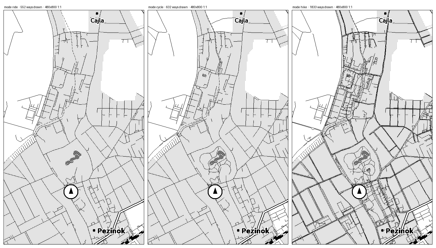
A rider, a cyclist and a walker do not want the same map of the same ground. So the style file also declares, per mode, which road classes exist at all. After the build has intersected that list with what each rung draws, riding reads ten classes, cycling thirteen and hiking seventeen: cycleways and paths for the bike, then footways, bridleways, steps and the rest of the walkable network for the walker.
Those lists are compiled into one 32-bit mask per mode and rung, intersected with what that rung's style draws. The tile reader tests one bit before it decodes a way, so a footpath in ride mode costs nothing at all. On the same square of the Male Karpaty foothills, ride draws 552 ways, cycle 632 and hike 1,833.
Names, and the hole a label box leaves
Place names are styled here too, and the interesting field is the one we turned off. A label can sit on an opaque white box, which is what most maps do, or it can be knocked out of the map with a white halo around each glyph. The box is stronger. It also eats a rectangle of the map, and the widest rung allows up to 32 names at once.
Two tiers carry the hierarchy, since there is no colour to carry it: towns bold, villages regular, at a 29 and a 24 pixel line height. Line heights rather than point sizes, because the renderer picks the largest built-in face that fits, off a fixed seven-step ladder of built-in faces. Both sizes drop at the widest rung: towns to a 24 pixel line height, and villages to a config value of 8, which the ladder's floor clamps up to 23 pixels, the smallest label the panel can show. That is where the job stops being "read the name" and becomes "there are five towns and a lot of villages, and that one is Modra".
The counts are per rung as well, from three names at the closest rung, which shows 480 by 800 metres and usually one settlement, up to 32 at the widest. Labels are placed by rank, and each one is dropped if it collides with a name already placed or if it would cover more than 8 percent of itself with the route. The route is the one thing a name may never hide.
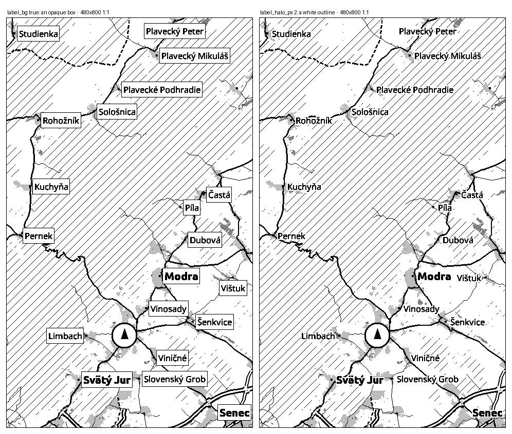
label_bg true, the classic white box. Right: a two
pixel halo per glyph, which is what ships. Same names either way, and only one of them
still has a map under them. Two 480 by 800 frames at 1:1.
The marks that buried the map
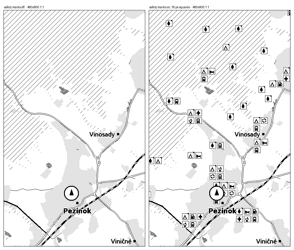
Not every dial in the file is a win, and the style file is where that gets found out. POI marks are 18 pixel squares with an 11 pixel glyph inside, screen sized so they stay legible at every rung. Turn them on over a dense area and they cover the thing they are annotating.
The fix is in the same file: a clustering radius, and a per-rung cap, so a marks layer that works at 12 metres per pixel does not have to work at 45. Which is the pattern for all of it. Nothing here is settled by argument. It is settled by rendering both and looking.
Two seconds per edit
Style work used to mean building firmware and flashing a device for every change. It does not any more. The firmware's map renderer also compiles as a plain laptop binary, against the same tiles the device reads, so a change to the file is redrawn in about two seconds. Every image on this page came out of that binary.
There is a fixed list of reference views for the same reason a photographer keeps a test chart: a visual regression is only visible against ground you have seen before. Each one renders the whole seven rung ladder from one anchor, so a change can be judged along the ladder and not just at the rung it was made for.
And a caveat we keep saying out loud, because it is the honest part. These are laptop renders from the device's own renderer, which is close to the panel and is not the panel. A two pixel halo on glass, a hairline under low contrast, whether a dither reads as tone or as dirt: those get judged on the device, in daylight, or they are not judged at all. The position marker in these frames is the style's generic puck rather than the mode marker the firmware draws over it.
Read it, or change it
The style file lives in the firmware repository, with the reasoning kept next to the numbers as comments, because a width with no reason attached gets "fixed" by the next person.
What the style cannot do yet
- No colour, and no grey on the map. The panel can do four grey levels, and the map uses none of them. Grey costs a slower refresh, and dither buys the same separation at the speed of black and white.
- Junction dots are authored and not drawn. The rules are in the file, the tiles carry the junctions, and the renderer has no pass for them yet.
- The style is per build, not per rider. Changing it means a firmware build. A rider-facing setting for it is not designed, and would need a load-time parser the device deliberately does not have.
- Contours are not in it. Elevation shading is the obvious next thing a hiker wants, and neither the tiles nor the style carry it today.
- The style is authored against one 480 pixel canvas. Screen-space numbers like the marker's anchor are written for the X4 and X4 Pro's 480 px width. On a wider panel (the X3 at 528, the LilyGo T5 S3 Pro at 540) the position marker is rescaled to the real width, but place-label placement and the marker's knockout box still read the raw, unscaled constant, so a name can land in the wrong spot there. Not fixed yet.